
Rotation Compresses
The June-July setup, the bifurcation that follows, and the rotation pattern that tells you which path

I organized music festivals for a living, and long before that I threw parties in high school. The operations were the part I was good at — the ingress, the egress, the read on a room. So trust me on this, because I have watched it more times than I can count, from a keg in a bucket to booking talent for my stage at Coachella, where reading the crowd was a critical part: all parties end the same way, and for the same reason.
A party ends because each new wave of arrivals has a shallower commitment to the place than the wave before. The early crowd came for the host or the talent. The next wave came to meet their friends, or maybe for position on the dance floor. By the time the strangers arrive — the ones who heard there was something happening and walked over from a shittier party down the street — nobody in the room has any relationship to why the party started. They came for the energy, and energy is the one thing a room cannot manufacture once the people who generated it have gone home. The crowd peaks in size at the exact moment it hollows out in conviction. That is not a coincidence. That is the mechanism.
Markets end the same way, on the same logic, for the same reason. The pattern has a name in trading — rotation compression — and the documented record of it runs back through every major cycle of the past century: 1929, 1973, 2000, 2008, 2021. It is running now, and the next eight weeks will determine which form it takes.
This piece lays out a working thesis: a brief consolidation, a final thrust to S&P 7,600-8,300 and Nasdaq 26,900-29,400 into June, a coincident IPO supply wave that confirms the late-stage signature, and a crypto leg into July or a little later. Then a drawdown whose depth determines everything that follows — a shallow 6%-12% shake-out or a deeper 15%+ cycle peak. The cycle work, flow and positioning data, and the technicals are the timing spine. Rotation compression is how you confirm or deny it from the tape itself.
What rotation actually is
Rotation is the river of capital changing course. Money moving from tech into energy, from stocks into bonds, from large-caps into small-caps, from boring into speculative. Distinct from a sell-off, which is the water level dropping. Rotation is direction. Sell-off is volume.
The textbook sector rotation map you were taught — tech leads early cycle, industrials and financials in the middle, energy and materials late cycle, staples in recession — still works in the slow lane. The problem is that the map was drawn for a universe where the relevant rotation happened between sectors of the same equity market. Three things have changed that universe:
1. The risk curve is much longer than it used to be. It now extends past small-cap equity into a parallel speculative complex — spot crypto ETFs, leveraged crypto products, crypto-treasury companies, 24/7/365 perp markets and prediction markets — that did not exist as a destination for retail capital before 2017 and did not become institutionally normal until the spot Bitcoin ETF approvals of January 2024.
2. Mega-cap concentration distorts the index signal. When seven stocks drive most of the index’s return, sector-level rotation tells you very little about what the average dollar is doing.
3. Policy floors have extended cycles past their textbook endpoints repeatedly since 2009. The “late-cycle” trade has been recommended for so many consecutive years that calling something late-cycle has lost most of its information value.
The map needs more rooms. Three of them, on three timescales.
Three clocks
A musical piece runs several lines at once — a fast lead line on top, slower chords under it, a bassline slowest of all. They play simultaneously at different speeds. Markets are the same: three clocks, fastest to slowest.
The risk-curve clock (the fast lead line — weeks to days). Capital walking up and down a staircase of risk tolerance — Treasuries at the bottom, then investment-grade credit, high-yield credit, large-cap equity, small-caps, story stocks, crypto majors, crypto alts, leveraged products on top. The walk is mostly upward in a cycle’s expansion and frenzy phases and abruptly downward in resolution. The Anatomy of a Blow-Off Top documented the historical evidence for the sequence — the speculative tier peaks first, the broad index and its cap-weighted leaders co-peak, and defensives don’t outperform until after the index has already rolled. This is the clock that matters for active traders, and the staircase is how you watch it.
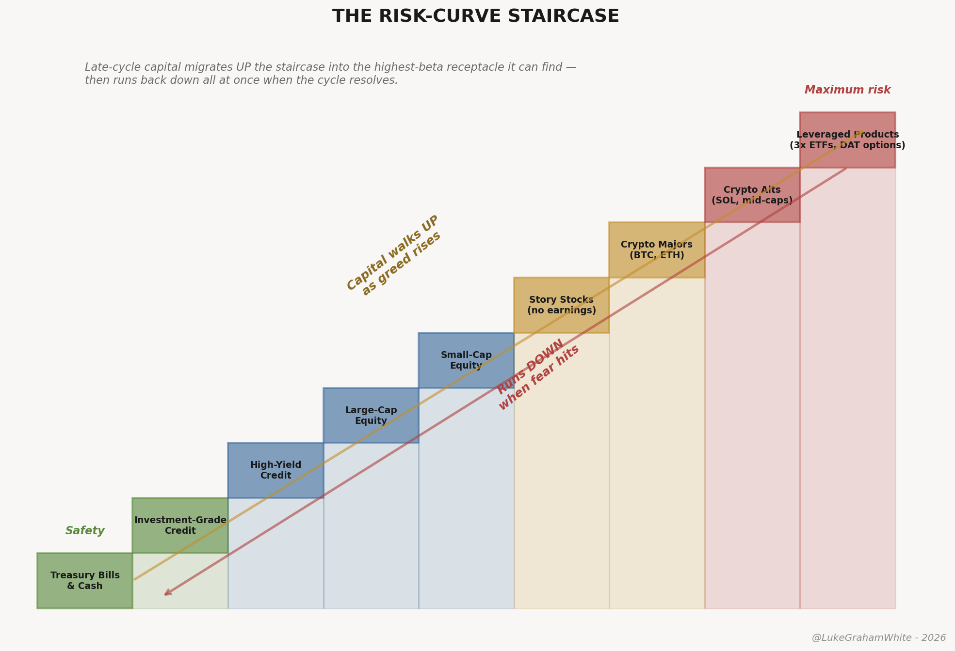
Figure 1 — The risk-curve staircase. Capital walks up as greed rises, runs down when fear hits.
The sector clock (the chords underneath — months to quarters). The textbook map — industries rotating against each other as the economy moves through expansion, peak, contraction, trough. Loud, widely tracked, mostly priced in by the time it’s visible.
The surge clock (the bassline — decades). Carlota Perez’s fifty-to-sixty-year technology cycle — installation phase ends in a bubble, deployment phase delivers the productivity. I laid the full framework out in The Long Forgetting. The short version for here: 2000 was the fifth surge’s installation blow-off, and the open 2026 question is whether AI is a sixth surge beginning or a late-deployment overlay on the fifth.
Mixing the clocks is the central analytical error in this domain. Pick one for the trade. Watch all three for context.
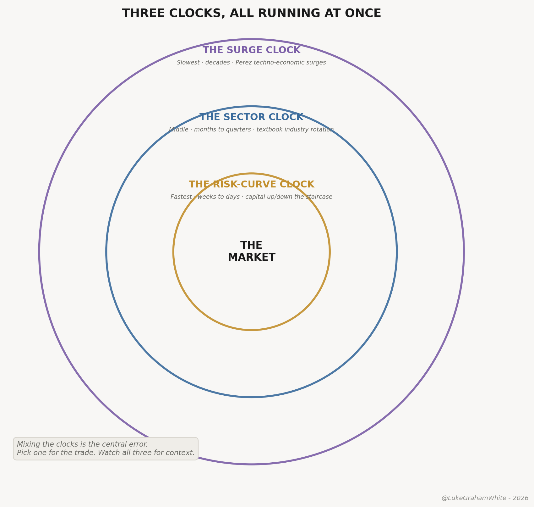
Figure 2 — Three clocks, three timescales, all running at once.
The thesis
In The Anatomy of a Blow-Off Top I made the case that speed is itself the signal — that a single parabola tops not when price stops rising but when the rate of rise starts contracting, the gains compressing from a year into six weeks into three. This piece is that same compression one level up. Not the velocity of a single asset into its peak — the velocity of leadership itself changing hands as the cycle ages.
Leadership duration shortens as the cycle ages — and collapses in its final phase. Early on, a single regime can lead for years. By the terminal phase the holding period of leadership has decayed to weeks, then days. The compression is not a clean, even decay — the middle of a cycle can grind for months between rotations — but the direction is unmistakable and the end is violent: like a ripple radiating across water, the late rings carry less energy and die faster than the ones before, until the surface is just chop.
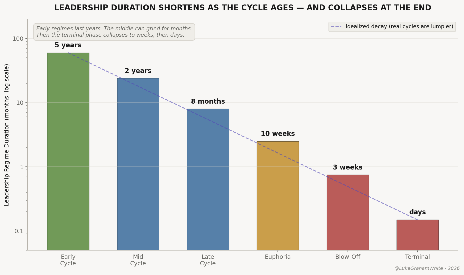
Figure 3 — Leadership duration shortens as the cycle ages and collapses in the terminal phase.
The mechanism is the marginal buyer’s holding period. Early in a cycle, the marginal dollar belongs to investors with multi-year theses who tolerate drawdowns; late in a cycle, to traders whose horizon is weeks, then days, then hours. The patient capital has already deployed; the only buyers left are chasing what just moved, and each cohort holds for a shorter span than the one it replaced. That decay is the compression.
Weekly tell
1. Credit spreads — the bottom of the staircase
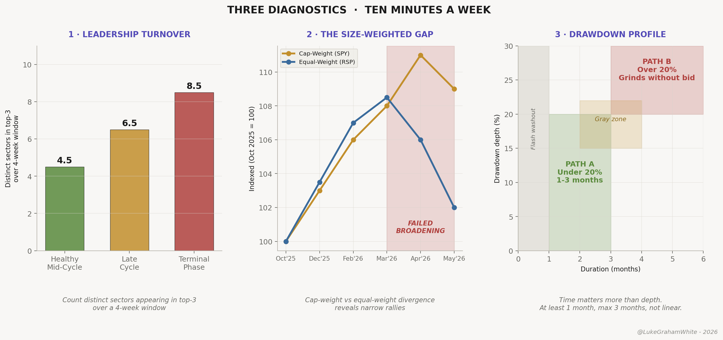
Anatomy ranked cap-weighted concentration as the breadth signal that has marked every major top since the railroad era. For this rotation piece, though, a second signal matters more: credit spreads. Think back to the staircase from earlier — the safest assets on the bottom steps, the wildest speculation up top. Concentration tells you the top steps are overcrowded, too much money piled onto too few names. Credit spreads tell you whether the bottom steps specifically are starting to give way — the safe assets, the ones that are supposed to hold. That second read is what times the rotation, because capital doesn’t leave the crowded top until the safe bottom starts to buckle — until investors demand more just to keep standing on the lower steps.
Pull the high-yield credit spread — the extra yield investors demand to hold junk corporate bonds over equivalent Treasuries. This is not the Treasury yield itself; it is junk-minus-Treasuries, which strips the risk-free rate out and leaves only the market’s pricing of default risk. The cleanest free version is the ICE BofA US High Yield OAS (copy and paste me: BAMLH0A0HYM2); bookmark it and watch the direction, not the level. Here is the whole signal as a party, by the number you’ll see on that chart: ~2.78 where it sits now, the party’s a rager; ~3.5–4.0, the first real widening — a few guests slipping quietly down the stairs; 5.00, the stampede zone, the top of the staircase broken and everyone making for the one door at once, cops on the scene. Compressing or flat, as it is now near 3%: risk is still being underpriced, the staircase is intact, the party continues. Widening from multi-year tights while equities are still near highs is the credit market repricing the cost of being long risk before the equity market does — and that divergence is one of the earliest reads that the rotation down the staircase has begun. Credit usually moves first because the people who price it are paid to worry about getting paid back, not about missing upside.
2. A failed broadening
From October 2025 through the end of March 2026, the equal-weight S&P 500 outperformed the cap-weighted version. The breadth gap was closing. Small caps were participating. The “great rotation” was the dominant theme in Q1 2026 financial media.
At the end of March, the move reversed. Mega-cap leadership re-asserted and the equal-weight gave back most of its outperformance. The same thing happened within technology — the equal-weight tech index (RSPT) had been beating the cap-weighted one (XLK, the Mag-7-dominated version) into March, then that ratio rolled over too. The broadening failed across the index and inside its dominant sector in the same month.
A failed broadening is more bearish than no broadening at all: the market tested whether anything but the existing concentration could lead, and concluded nothing could. The reversal coincided with the Iran conflict and the early Warsh rate-hike repricing — but the signal is the persistence. Six weeks after the shock eased, leadership still hasn’t re-broadened. The market had its chance to reset and broaden out of the washout. It didn’t.
2021, with the dates
Anatomy showed that BTC-versus-equity sequencing is unreliable while within-asset sequencing is dependable. This piece is about what that sequencing looks like as a rotation map — the actual order capital changed hands, with the dates, so you can recognize the rhythm when it runs again.
The ARK Innovation ETF peaked February 12, 2021. The Russell 2000 topped March 15 — four weeks between the most speculative growth corner and the broad small-cap index. The Nasdaq Composite, Bitcoin, and Solana all topped within the same November 2021 window — BTC near $69,000 on November 10, Solana around $260 on November 6, the Nasdaq intraday high on November 22. Eight months separate the small-cap top from the large-cap-growth-and-crypto top. The S&P 500 made its high January 3, 2022 — six weeks after the Nasdaq. Inside crypto, the mid- and low-cap alts ran one final leg after Bitcoin had already turned, and LUNA, the highest-beta bet of the cycle, didn’t collapse until May 2022, six months after the broader cycle had ended.
The sequence: ARK → Russell → Nasdaq/BTC/SOL → S&P → alts → terminal blow-ups. Intervals: four weeks, then eight months, then six weeks, then days within crypto, then months for the final fraud cleanups.
Notice those intervals do not shrink in a clean line — the eight-month gap in the middle is the longest of the whole cascade. This matters, because the easy version of this story (“each leg shorter than the last, a tidy geometric decay”) is wrong, and the data says so plainly. The mean gap between the 2021 leadership peaks was about 113 days, the median about 126, with a range from 31 days to 240. What compresses is not every interval uniformly; it is the terminal phase. Early leadership regimes last years. The middle of a cycle can grind for months between rotations — that eight-month ARK-to-Bitcoin gap was the market digesting one leg before starting the next. Then the end arrives fast: once the broad index rolls, the final legs flip in weeks and the last speculative blow-ups resolve in days. The tell is not a smooth metronome speeding up. It is a long, deceptive lull followed by a violent terminal flurry — which is exactly why the lull fools people into thinking the cycle has longer to run.
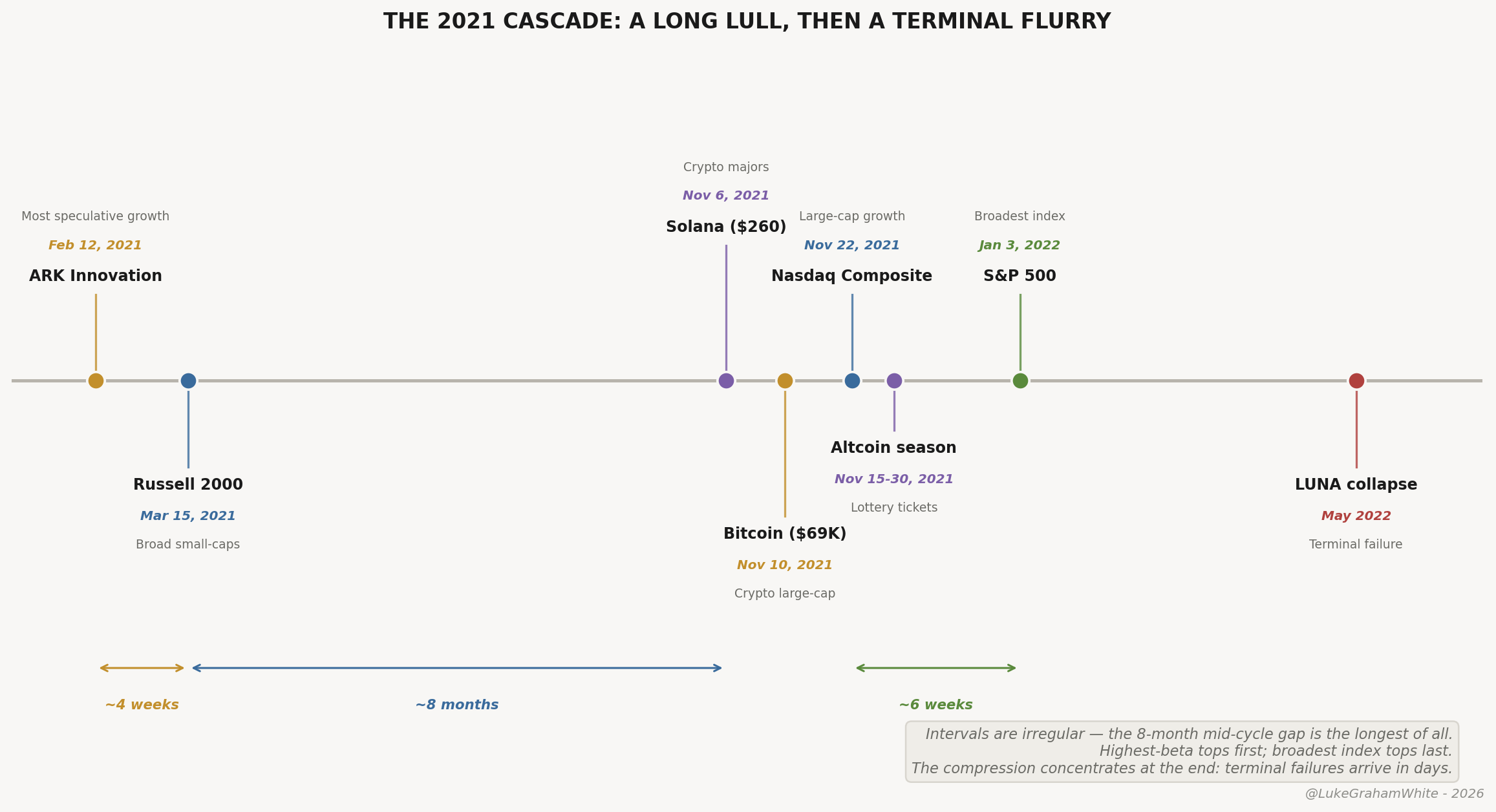
Figure 5 — The 2021 cascade. A long mid-cycle lull, then a violent terminal flurry.
The relevance for the current setup: the window from Nasdaq top to S&P top to the final crypto blow-up ran about six months. That’s the rhythm to expect if our cycle work plays out into June-July.
2000, with the part everyone forgets
The dot-com blow-off itself — the parabola, the global simultaneity, the CME-futures-as-trigger mechanics — is Anatomy’s territory. What that piece doesn’t cover, and what matters here, is where the money went next.
After the top, capital fled to cash for the better part of a year, then found commodities. Gold made its multi-decade low in February 2001 at roughly $255 and ran past $1,900 by September 2011 — a gain of about +645%. Oil moved from $25 in early 2000 to over $140 by mid-2008, roughly +460%. The capital displaced from dot-com found its destination with a roughly twelve-month lag — after a year of sitting in cash while the new leadership established itself. That lag is the single most important feature of post-blow-off rotation, and the one most traders get wrong by reaching for the next trade too early.
The part that matters most for the current tape: the internet was real. Broadband, smartphones, cloud — the technology delivered everything the bubble promised. Most of the bubble’s flagship stocks did not survive to participate in any of it.
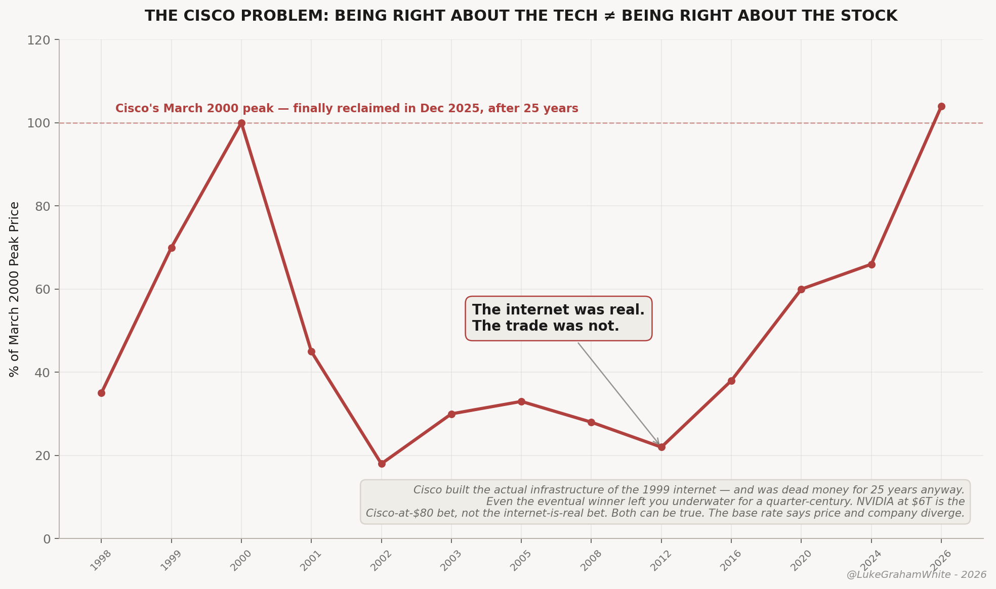
Figure 6 — Being right about the technology is not the same as being right about the stock.
The internet was real. The trade was not — and that gap is a rotation signal, not a stock-picking footnote. The single most-crowded name sits at the very top of the risk staircase, which means it peaks first and falls hardest when capital rotates down. A century of tops shows what that looks like at the extreme.
Everyone reaches for Cisco: plumbing of the 1999 internet, peaked near $80 in March 2000, didn’t reclaim it until December 2025 — dead money for twenty-five years while revenue tripled. But Cisco was picks-and-shovels, and it survived. The sharper analog for NVIDIA is the name that was the revolution — the defining, most-crowded company of its phase. That was RCA: the purest play on radio, the stock that was the new era. It rose ~200-fold into 1929, fell 98%, and took roughly thirty years to reclaim its high. The round trip was the good part — RCA never found a second act, and by 1986 was bought and broken up by GE. The company is gone; the name is a logo on other firms’ televisions.
Not isolated. Polaroid — the most-crowded tech name of the Nifty Fifty, two-thirds of the instant-camera market — fell 91% into 1974 and went bankrupt in 2001. The dot-com flagships liquidated outright.
The rotation rule: the name at the top of the staircase is the worst place to be when it rotates. Being right about the technology and being right about its most-crowded stock are different bets — and the second one, at the peak, usually loses.
1989, the rounding top — and why it matters now
Not every cycle top is a vertical climax. The Nikkei in 1989 was the other kind — a rounding top that ended a four-decade bull run with no clean climactic event, no margin cascade, just a slow distribution disguised as consolidation. I covered the full mechanics in Anatomy: patient capital rolls over, leveraged retail cascades, and the difference is entirely in the leverage structure. The one-line version: the Nikkei peaked at 38,915 on December 29, 1989, the BOJ had been hiking into stretched valuations, and the index simply stopped going up — roughly halving within three years, ultimately down about 80% into its 2009 low, and not reclaiming the high for thirty-four years.
Here is why it matters. Kevin Warsh was just sworn in as Fed Chair, and CME data shows roughly a 40% probability of at least one rate hike by year-end. A hike is not our base case, though — despite the hawkish repricing, we expect Warsh to cut. That choice shapes the top: a cut points toward a vertical blow-off, a hike into stretched valuations toward a slow roll the way Japan did in 1989. The hike-driven roll is the harder tape to read, because the distribution hides underneath a roughly-stable index.
One caveat is the hinge: a cut is fuel only if it lands into a market still working — the liquidity-add into strength Anatomy describes. A cut into something breaking — a credit event, a growth scare — is not fuel but confirmation, the way the 2007 cuts preceded the crash rather than a melt-up. And the base rate cuts against our own call: across the twelve Fed easing cycles in the modern record, the central bank began cutting after equities had already peaked in ten of them. The Fed is usually late, easing in response to weakness already underway, so a cut that precedes and fuels a final blow-off is the rare case, not the default. We hold the view on the flows, positioning, and cycle work — but the historical odds are a headwind, and pretending otherwise would be selling rather than analyzing.
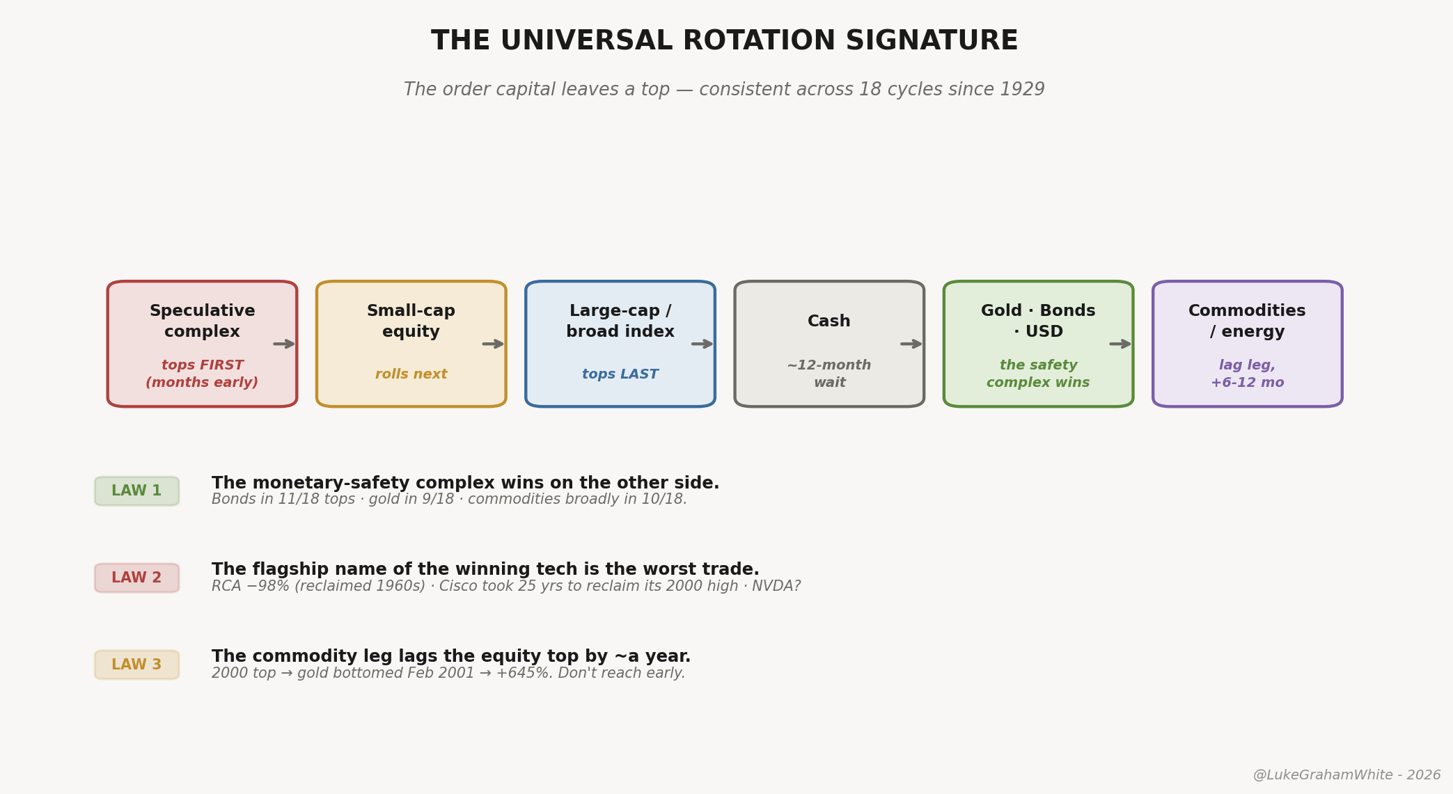
What every top since 1929 has in common
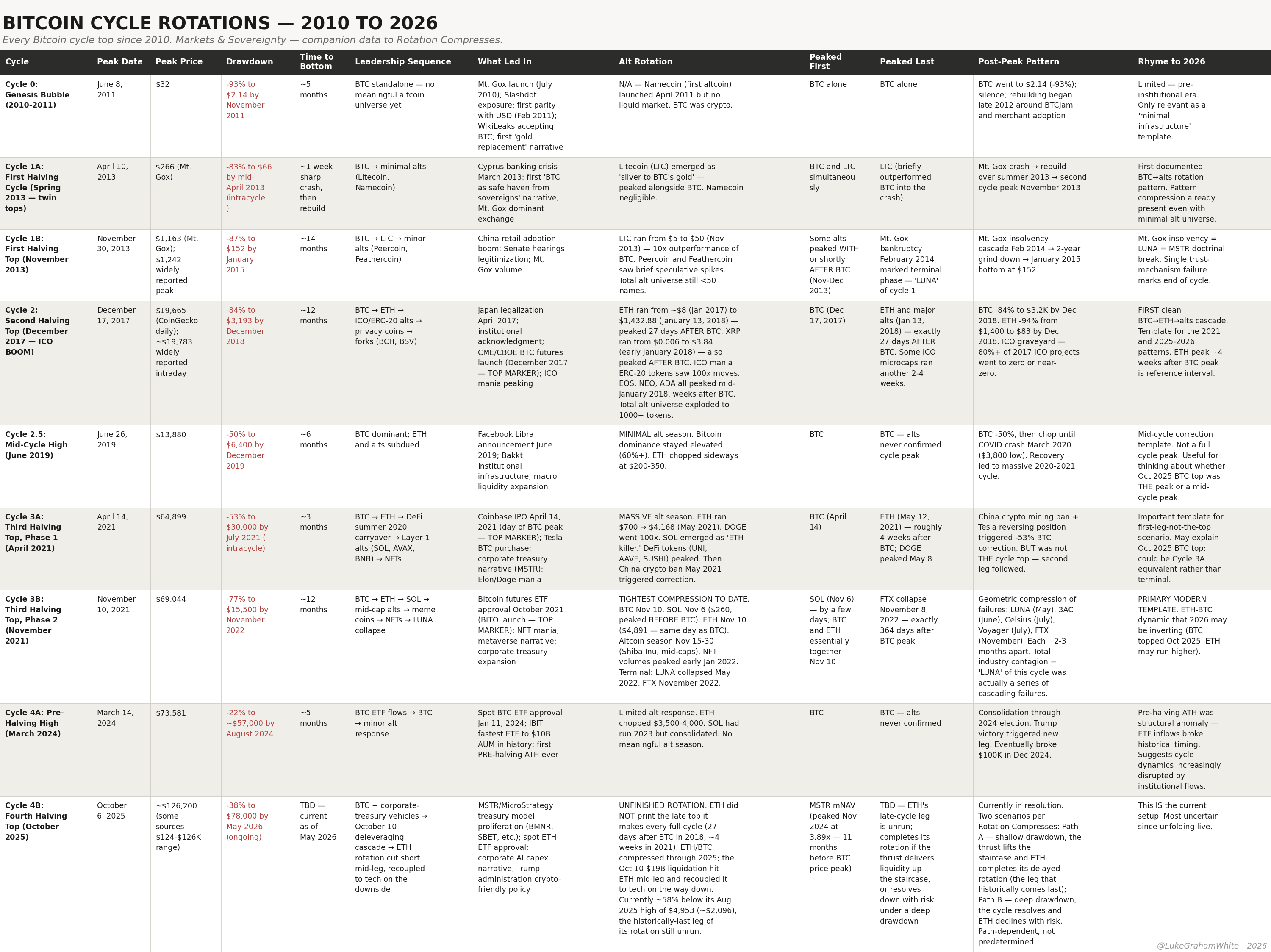
Three cases aren’t a law. So I pulled all of them — eighteen major equity tops since 1929, nine Bitcoin tops since 2010 — and logged what led in, what won after, and how the rotation actually ran. The flagship-is-the-worst-trade pattern from the last section held across all of them. So did one more, and it is the one that pays.
The monetary-safety complex wins on the other side. Across the eighteen equity tops, bonds show up in the post-peak winners eleven times, gold nine, commodities or energy ten. Capital leaving a blow-off doesn’t evaporate — it walks back down the staircase into the things that pay you to wait. Roughly six times in ten for a century, the trade on the far side of the top was gold, bonds, or the dollar. That is the empirical spine of the rotation.
Both patterns, every cycle, with the dates and the drawdowns, are laid out in the appendix. The cases above aren’t cherry-picked — they’re representative.
The current tape: May 25, 2026
Where we are, with the dates and the numbers. The S&P 500 printed fresh records into mid-May, closing above 7,500 on May 13, then chopped lower as the 10-year yield backed up toward 4.6% — spiking yields spooking a richly-valued tape — to trade around 7,400-7,470 by May 21. Nasdaq tracked the same path near 26,400-26,600. Bitcoin sits around $76,700, Ethereum near $2,100 — both well off their 2025 highs while equities hold near records.
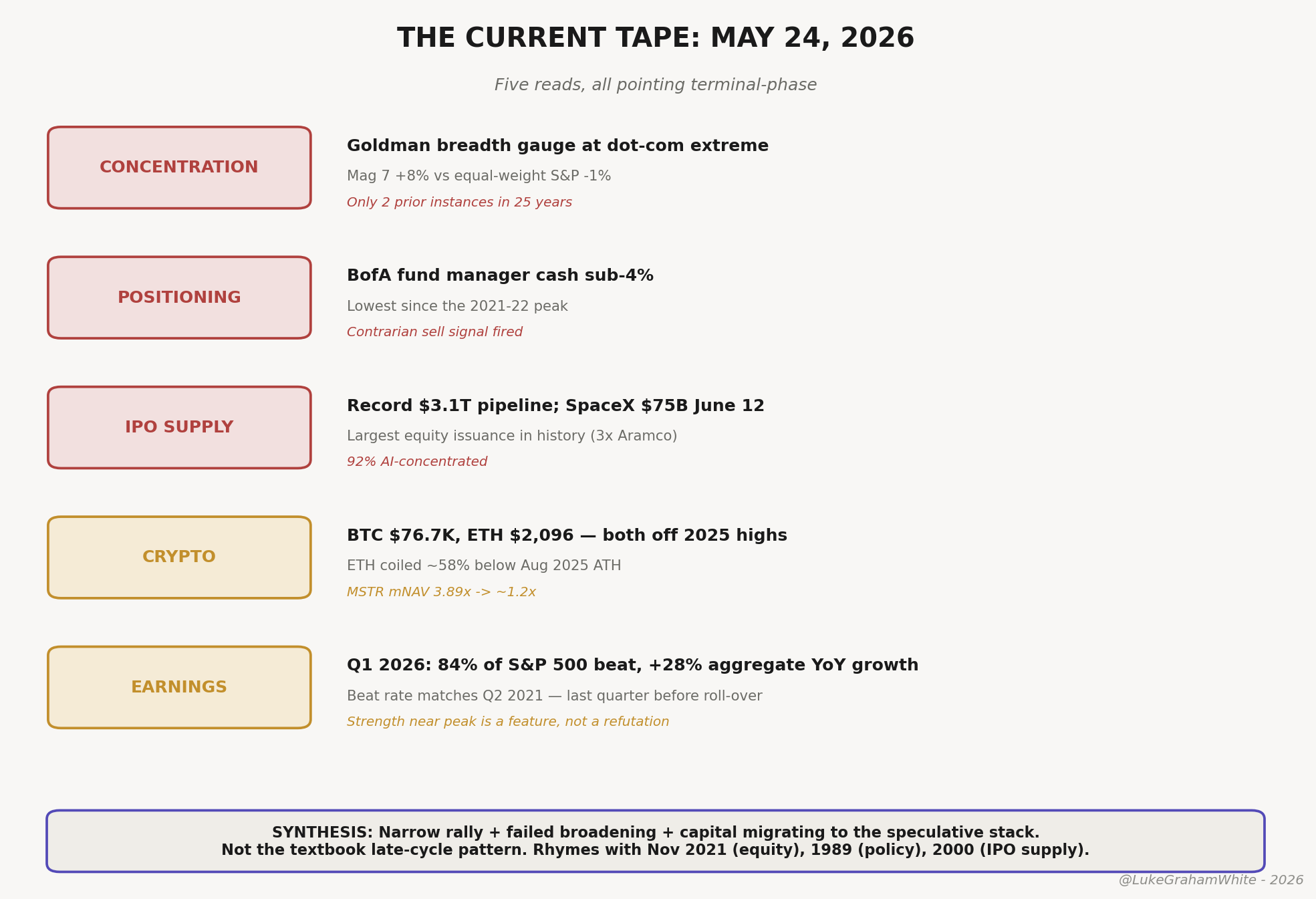
Figure 7 — The current tape: five reads, all pointing terminal-phase.
Three reads matter. Concentration is at dot-com extremes — Goldman’s breadth gauge sits where it last sat in 1999-2000, with the Magnificent Seven carrying the index while the average stock lags. Positioning is at terminal-cycle extremes — BofA’s fund-manager cash dropped below the 4% threshold that fires its contrarian sell signal, the lowest since the 2021-2022 peak. Supply is the underweighted one: a record 2026 IPO pipeline worth roughly $3.1 trillion in combined company value, ~92% of it AI-concentrated, with SpaceX targeting a ~$75 billion raise at a $1.75 trillion valuation and a June listing. A capital ask that size landing in the cycle-projected top window is the textbook supply-side signature of a blow-off — SPAC issuance played this role in 2021, the 1999-2000 IPO wave for the dot-com top. Neither approached this scale.
But the read that matters most is happening underneath the headline crypto numbers, and it is the one insight from the current tape worth holding onto.
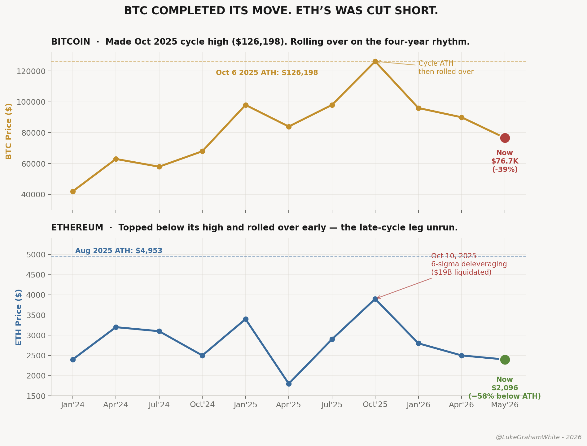
Figure 8 — BTC made its cycle high in October 2025. ETH did not — its late-cycle leg was cut short before it ran.
The October 10, 2025 event reset the crypto clock — and only for one asset. On that day crypto suffered the largest single-day deleveraging in its history: over $19 billion in leveraged positions liquidated in 24 hours, roughly 9x any prior single-day record, triggered by a 100% China tariff headline and amplified by fragile venue-level margin engines. BTC fell 14% intraday, ETH 12%, SOL 40%. Total perpetual-futures open interest collapsed 43% — from roughly $217 billion to $123 billion — in a day. The months since have not been a normal bear grind; they have been the digestion of a single concentrated wipeout that compressed a year-plus of capitulation into one day. That is the mechanical cause of the lag — and it is why the setup now is a coil, not exhaustion.
Now the fun one — the one that’ll rile up half the timeline. Crypto Twitter is writing Ethereum’s obituary again. It’s the same eulogy they deliver every bear cycle.
So look at what the rotation data actually shows. ETH tops at or after BTC. It has never topped before it.
In the cycles that ran to a real blow-off, ETH topped weeks later. In December 2017, BTC peaked on the 17th; ETH ran another 27 days, finishing a +17,800% cycle on January 13. In April 2021, BTC topped on the 14th; ETH climbed four more weeks, a +495% run into May 12. November 2021 was the one exception to the lag — ETH and BTC peaked the very same day — but even then, ETH did not top first.
The reason is structural. ETH sits a rung above BTC on the risk staircase, and the higher rungs top last. That is the sequence this entire piece is built on.
This cycle broke the pattern — or paused it. BTC made its high in October 2025. ETH did not. It was still climbing when the October 10 deleveraging hit it mid-leg. It rolled over without ever printing the late top the data says should come.
So BTC completed its move. ETH’s was cut short, the final leg unrun.
That leaves ETH ~58% below a high it already reached once — $4,953, in August 2025 — with the part of its rotation that historically comes last still ahead of it. Whether that resolves up or down depends on which path the drawdown takes. You already have the tree for that.
The bracketed June setup
The working thesis, with the bifurcation that follows.
Step 1: the consolidation already happened. We called for a shallow pullback of at least ~150 S&P points off the early-May record, and we got it — the mid-May chop into the 7,400s on the back-up in yields was the setup, not the top. That leg has largely resolved, and the tape is now turning back up toward the thrust targets. The depth held shallow, which keeps the thrust thesis alive; a break far below that consolidation low is what would have changed the picture early, and it didn’t come.
Step 2: final thrust higher into June. S&P 7,600-8,300, Nasdaq 26,900-29,400. From the current ~7,450, the lower bound is about +2% and the upper bound about +11%. The width of that range is itself information — the lower bound is a measured final extension, the upper bound requires a genuinely vertical, blow-off move in roughly six weeks. Which print arrives depends on internals: rotation compression accelerating, leadership turnover climbing toward eight or nine distinct sectors in a four-week window, IPO supply absorbing aggressively, retail flows expanding into the speculative complex. If those fire, the upper bound is reachable. If they don’t, the lower bound is likelier and the top arrives sooner with less drama.
Step 3: SpaceX as the supply-side confirmation. A ~$75 billion raise at a $1.75 trillion valuation, listing as early as June 12, is the largest capital ask in history landing at the moment of peak speculative appetite. A clean print that absorbs the ~30% retail allocation and holds its issue price confirms the blow-off — the market proving it can swallow anything. A weak print, low-end pricing, or a break of the issue price in the first two weeks is the opposite signal: distribution, the cycle rejecting further supply. Either way, the first three weeks of June are the highest-information window of the year.
Step 4: crypto leg on the lag into July or later — ETH-led, not BTC-led. BTC is already late, past its October 2025 high. The leg that runs after equities is the one ETH never completed — back toward its $4,953 high, ETH first, then large alts, then memes — with ETH-treasury vehicles expanding their mNAV multiples as the institutional tell. It carries meaningful probability under either path below, because crypto runs its own internal sequence on a different clock than equities. (Crypto’s rotation is nuanced enough for its own treatment — a crypto-specific piece and an ETH deep-dive are both coming.)
Step 5: the drawdown that determines everything. The depth of the post-June correction is the binary that bifurcates the second half of 2026.
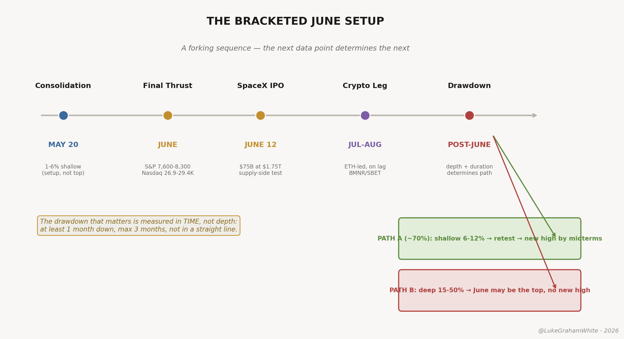
Figure 9 — The bracketed June setup. A forking sequence.
A word on what the cycle work is and isn’t doing. The price targets and June timing are a projection, not a law — and the bigger the cycle, the looser its timeframe by design, so treat the dates as a scaffold. The framework does not depend on them. If the thrust comes later, or the top is already in and there is no thrust at all, the diagnostic toolkit — leadership turnover, credit spreads, the failed broadening, the risk-curve sequence — still tells you where you are. The calendar is useful precisely because it can be proven wrong quickly. If the dates and the rotation reads disagree, believe the rotation reads.
The bifurcation: directionality by path
We read price, not feel: drawdown depth first, duration to confirm. None of what follows is a prediction — it is a map of conditional consequences. Identify which branch is active and the sector implications follow.
Path A: shallow drawdown, 6%-12%. Meaningful but not regime-changing — a mid-cycle correction inside an extending top. The market recovers through late summer, the equal-weight S&P retests broadening into autumn, and a final marginal new high arrives around October, potentially around the midterms. June is NOT the blow-off top here — it is the first warning shot, and the cycle extends. Our cycle work puts the odds around 70%, not from bullishness but because multiple cycles align in the fall and winter pointing to another high.
Path B: deep drawdown, 15%-50%. A decline this size may not recover to new highs within 3-12 months absent a clean macro reset. June COULD be the top — but we won’t know for weeks, because a deep first leg and a dead-cat bounce look identical at the start. What follows through midterms is a sharp rally that fails before the prior high. The topping is sharper than a classic rounding top because the IPO supply wave and cash positioning are at cycle-peak extremes at once. No new high in 2026; the rest of the year is lower highs and lower lows.
The discriminator is roughly 12-15% of depth, then duration. In the gray zone between, speed is the tell more than level — a read, not a measured rule, but across the tops in the appendix the sharp impulsive breaks (1987, COVID, the Oct-10 crypto wipeout) tended to mark regime change while slow rolling grinds more often resolved as corrections. So a slow grind leans A, a sharp break leans B — as does crypto on the equity drawdown: BTC holding bid leans A, BTC breaking down in correlation leans B.
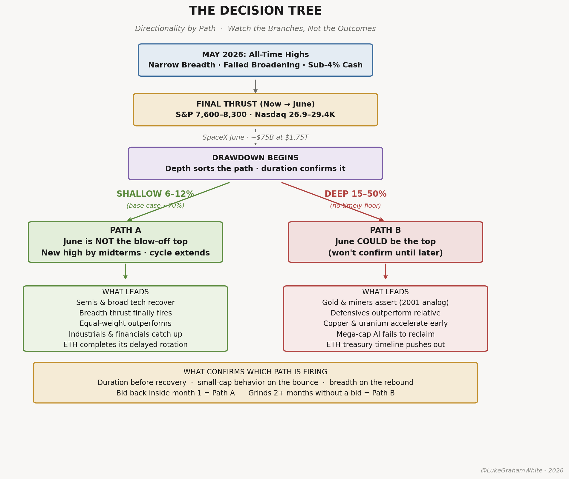
Figure 10 — The decision tree. Watch the branches, not the outcomes.
During the final thrust, mega-cap AI leads — semis, hyperscalers, the same handful of tickers that have carried the index since October — with the IPO-mechanism beneficiaries (the banks underwriting SpaceX, the brokerages absorbing the retail allocation) alongside. ETH and ETH-treasury vehicles run on the crypto lag. Gold and miners consolidate; defensives underperform.
Then everything sells initially — correlated drawdown is the terminal-cycle signature. Small caps lead down, and their behavior on the bounce is the single best diagnostic. Under Path A, semis and broad tech recover and lead the retest, equal-weight finally outperforms cap-weight, industrials and financials catch up, and crypto runs into year-end with ETH completing the rotation leg it never ran. Under Path B, gold and miners assert clean leadership — the 2001-2008 analog — defensives outperform relatively, the industrial-commodity leg begins early as copper and uranium accelerate, mega-cap AI fails to reclaim its highs, and the ETH-treasury timeline pushes out 3-12 months.
A note on the political backdrop, because it cuts against intuition. The administration — Treasury, a Warsh Fed, an executive that wants the market high into November — has every incentive to lean against a midterm drawdown. That makes it the most obvious catalyst for a Path A floor, and therefore probably not the one that fires: when everyone prices the visible intervention, the real support tends to come from somewhere less photogenic.
Both paths are live midterm scenarios — a thread I pick up in Everyone Is Right, Everyone Is Early. One note for the BTC four-year-cycle crowd: if Path A delivers an October low and a year-end high, the halving camp will claim victory on the timing. We read it differently — the business cycle trumps Bitcoin’s four-year halving rhythm, and that rhythm has largely been a self-fulfilling prophecy that worked until the flows got big enough to break it. Partly cope, sure, but also clear in the data once you stop mistaking the halving for the cause rather than the coincidence.
And don’t over-fit the catalyst. The trigger could be the market testing the new Fed, the IPO wave turning into a sell-the-news event, an absence of buyers above the target, or a genuine black swan — even a sudden outbreak of peace that unwinds a risk premium. Look for the pattern, not the trigger; the catalyst is just the story the tape tells afterward.
And on the longest horizon, the appendix’s second law still governs: AI is real, but the names that captured the build-out have rarely been the names that led the bubble. Separate the technology bet from the stock bet.
Positioning the rotation: where capital goes next
The hardest question this framework forces on you is not when the top arrives — it is where the money goes after it. Most late-cycle commentary stops at “be defensive,” which is correct and useless. Defensive against what, allocated to what, on what timeline? The appendix answers the historical version, and the 2000 lag answers the timing one: capital sits in cash for the better part of a year before the new leadership establishes itself.
The 2026 setup has one structural difference from the 2000 template: the commodity rotation has already begun — and gold’s monetary leg has already had a blow-off of sorts, we’ll see if it sticks (base case is no). Gold ran from roughly $2,400 in mid-2024 to a record $5,598 in January 2026 — up more than 130% — then took its largest monthly drop since 2013 and sits near $4,500 today, about 20% off the high. That sequence is itself a tell: the monetary-debasement leg is mature, not early. The monetary leg — gold, silver, the streamers and major producers, driven by loose fiscal conditions, central-bank buying, and dollar fatigue — is well underway. The industrial leg — copper, uranium, base metals, the electrification and data-center-power names tied to the surge clock’s production phase — has not yet fired. It becomes the leadership trade only after the equity blow-off resolves and capital rotates from financial speculation into physical infrastructure.
Oil sits apart from both legs. WTI spiked to roughly $106 in early May on the Strait of Hormuz closure, then broke down to about $91 — down ~14% in three weeks — as reopening odds rose. That move was a geopolitical supply shock, not the demand-led industrial rotation firing. A war premium that comes and goes is noise on top of the signal; the industrial leg is a sustained, demand-driven bid, and oil’s round trip is not it. Don’t mistake the spike for the rotation.
The trap is sizing for one leg as if it were the whole thesis, then bailing during the correlated drawdown that hits commodities alongside equities in a Path B decline — exactly when you need to hold through to capture the multi-year leg on the other side. The specific names, tier weights, triggers, and deployment schedule are the work of a piece coming soon.
What would prove the framework wrong
No final thrust materializes. The invalidation is clean and worth stating plainly: if the market rolls over from here and a pullback extends past roughly 10% without recovery, the thrust thesis is dead and a top is already in. As of now the tape is moving the other way — back up off the mid-May consolidation toward the thrust targets — so the thesis is live. But the level does the talking. A decisive break below the consolidation low, not a headline, is what would flip this; under that scenario the bifurcation begins immediately rather than after a June print, and Path B becomes the default.
Breadth re-fires and holds. If the equal-weight S&P starts outperforming the cap-weighted version for two quarters running and the relationship survives a real drawdown without reversing, the cycle is broadening rather than compressing. The textbook late-cycle trade gets the last laugh.
Financial conditions stay loose through 2027-2028. If the policy floor outlasts the rate-hike repricing — if Warsh proves less hawkish in practice than markets price — the cycle extends and the bifurcation arrives later. Since we already expect a cut, this isn’t a tail scenario to us; it would push every cycle framework on the desk, including this one, toward a later resolution. The most likely failure mode of any cycle thesis right now is that policy floors prove more durable than any historical framework can account for.
What the party teaches that the data doesn’t
The data tells you the cycle is late; the rotation framework tells you which path follows. The party tells you why. The IPO wave into June is the friends-of-friends spilling into the hallway; the crypto leg into summer is the strangers who wandered over from the party down the street. The job isn’t to call when the music stops. It’s to watch how fast the crowd is turning over, because that, not the price, tells you what hour it is. And if the leaders are changing every Tuesday — keep your head on a swivel — the cops are already on their way. The only question left is which song is playing when they arrive. Until then, feel free to fight for your right to party.
This piece sits in sequence with The Long Forgetting (the surge clock context) and The Anatomy of a Blow-Off Top (what the terminal hour actually looks like). Where we go from here will largely depend on the tape. Perhaps we’ll have time to discuss how we got here and dive deep into history, or perhaps we’ll update our playbook and technicals.
Talk soon —
Luke
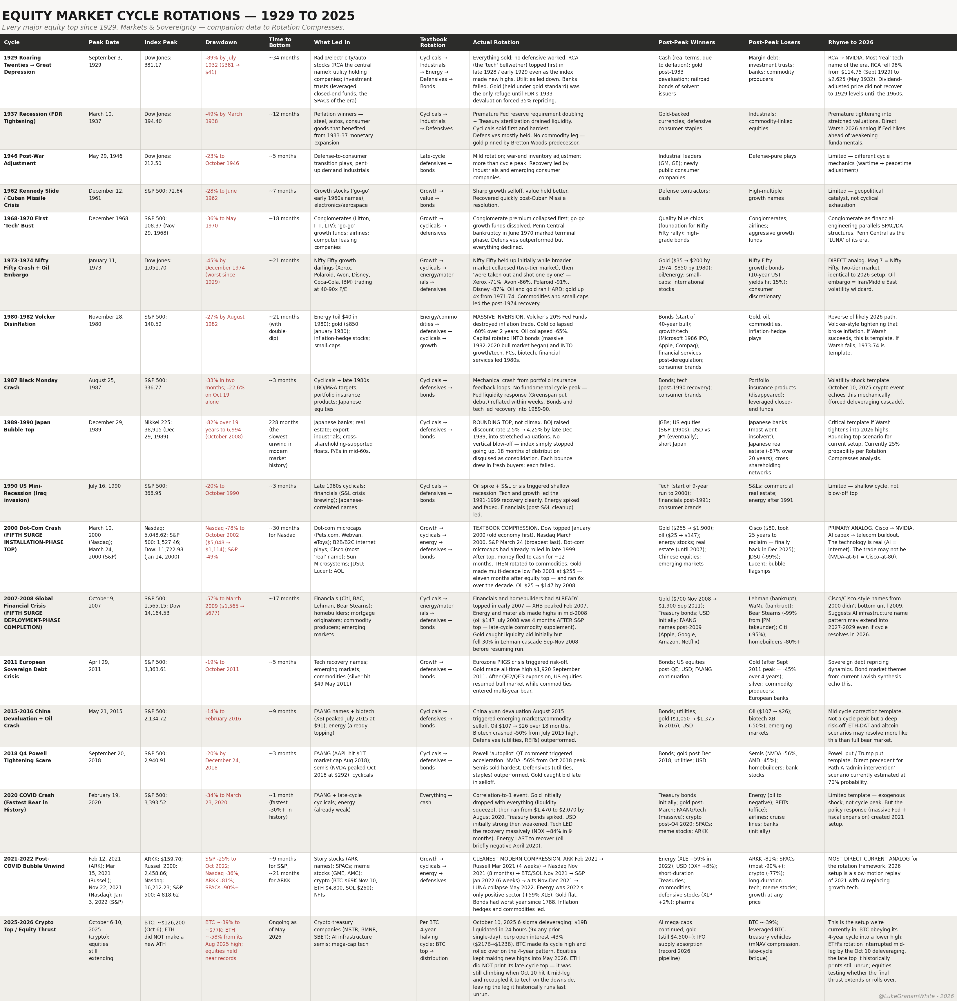
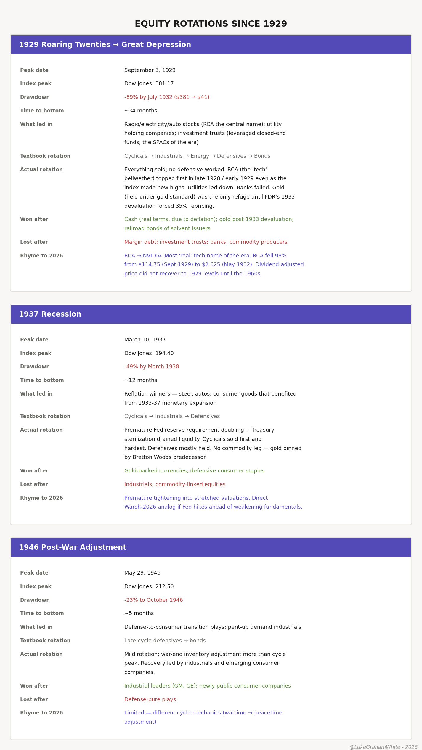
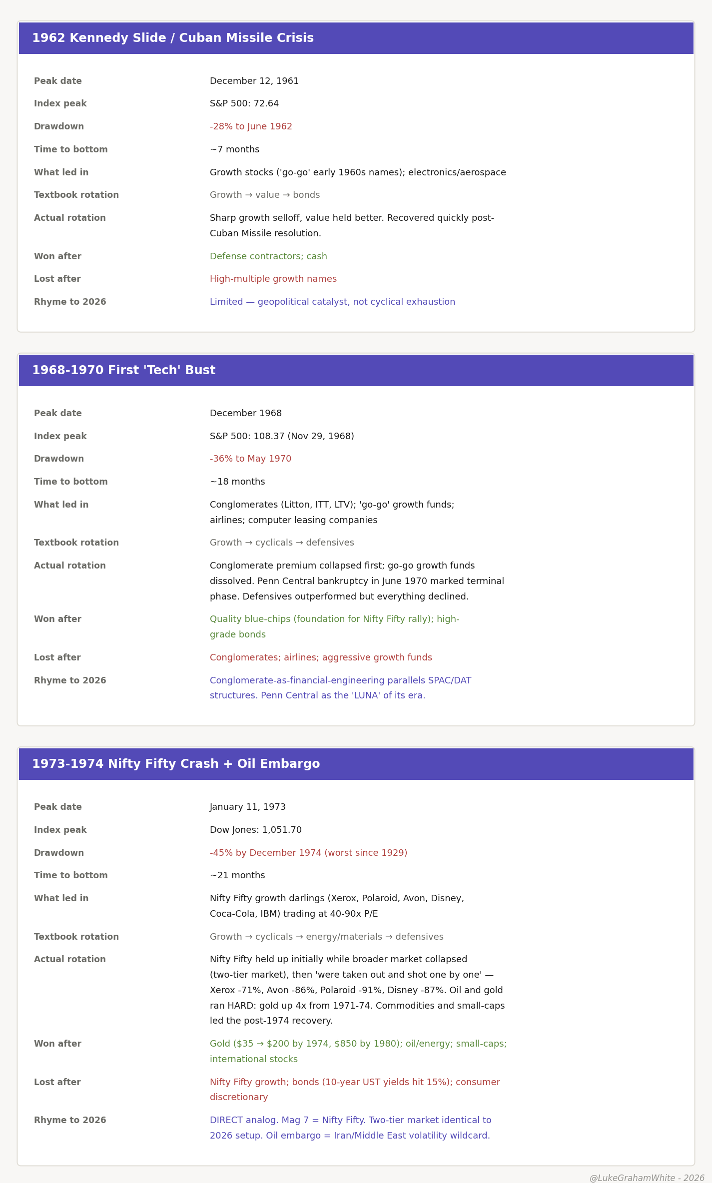
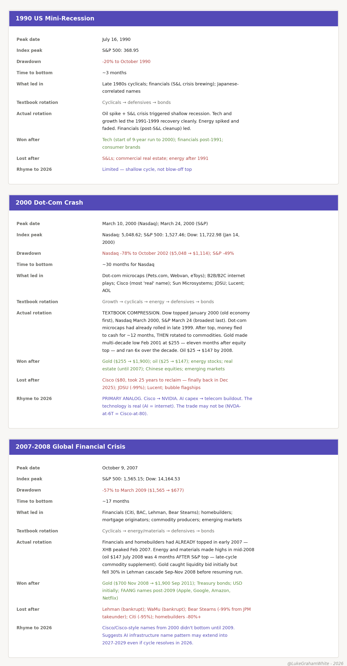
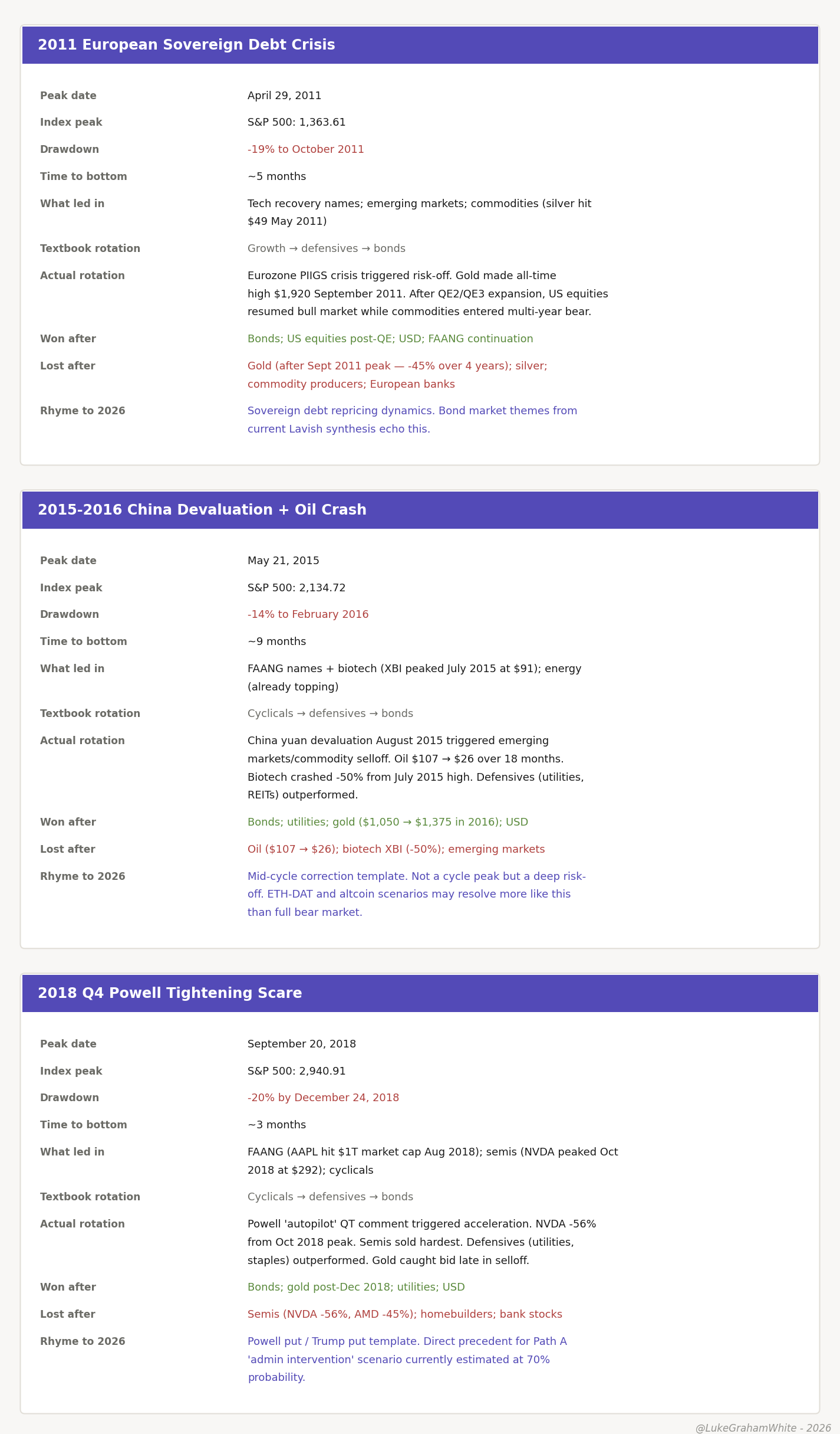
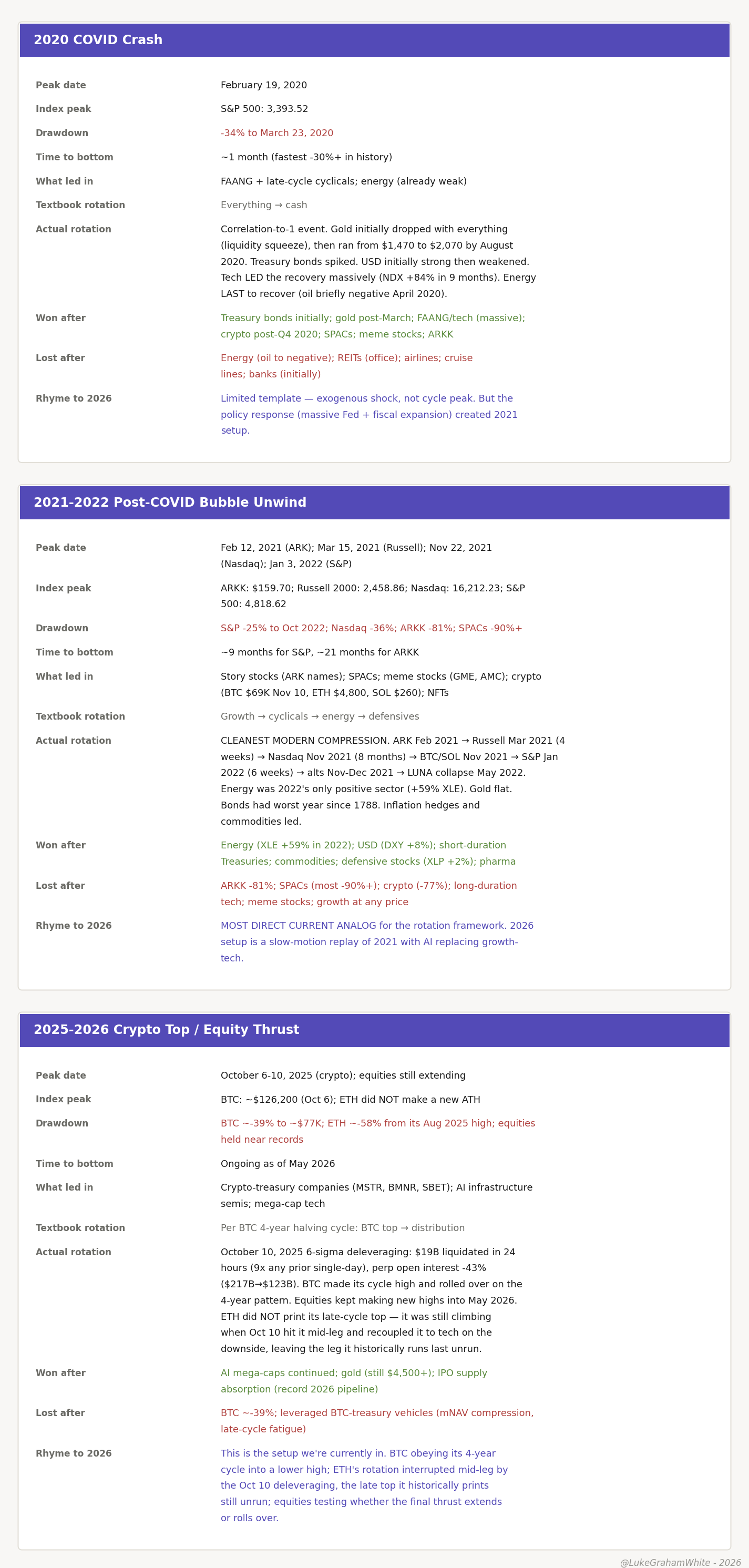
Appendix: Every Major Rotation Since 1929
The body makes three claims on the strength of this data: that the monetary-safety complex wins after a top, that the flagship technology name is the worst trade in its own boom, and that capital climbs and descends the risk staircase in a fixed order. Here are the receipts — every major cycle peak since 1929, eighteen on the equity side and nine on the Bitcoin side, with what led in, what won after, and how the rotation actually ran.
A few regularities didn’t make the body but are worth a line each. Cycle tops lean toward autumn — six of seventeen datable equity peaks landed in Q4, a tilt, not a rule. The highest-beta speculative complex tops first and the broadest, highest-quality index tops last — true in all eighteen, no exceptions. And a terminal trust-failure tends to mark the end rather than precede it: Penn Central in 1970, Lehman in 2008, Mt. Gox, LUNA, and FTX in the crypto cycles.
One necessary caveat on the Bitcoin data. The cleanest-looking headline in the crypto table is that drawdowns have shrunk across the major halving-cycle tops — 93%, 87%, 84%, 77% — as the asset matured and its holder base institutionalized. That is true for the four halving-cycle tops specifically, and it is a real signal. But don’t over-read it. The full nine-cycle series includes mid-cycle and pre-halving highs with drawdowns of 50%, 53%, and 22%, so the “every cycle compresses” framing only holds if you scope it strictly to the halving tops. The honest version: among comparable halving-cycle peaks the trend is real; across all Bitcoin highs it is noisier, and anyone who tells you the next drawdown is guaranteed shallower is selling the clean version of a messier truth.
What follows is the complete dataset — every cycle, every column. Eighteen equity tops, then nine Bitcoin tops.

Wow, you make these stats come alive, excellent content writing skills! While reading the scenarios everything was playing out like theater in my mind.
Amazing. relative strength, and momentum along with BTC/XAU show that bitcoin / Crypto topped in Q4 2024 - Jan 2025. The final leg in may through July shows a lot of exhaustion, and little optimism and interest in the market, which also coincides with the rotation into equities / commodities. I made the mistake of holding and believing into a raft that sailed and in hindsight the sentiment and technicals display this. Apathy and interest in crypto is at lows and the time based capitulation that we are seeing now does indicate this. Perhaps the four year cycle plays out. it would be better than experiencing another dead cat bounce that I describe 2025 was
Do you believe the highest beta risk in crypto will have a final leg and respect the business cycle as it always has?